Monday, January 31, 2011

This one goes out to all you high-rise dwellers.

For the record, your rented, architecturally-deprived home has just as much potential to be beautiful as the vintage walk-up with crown moldings, exposed brick, and a fireplace.

So no. more. excuses. Put your game face on and start taking notes.

We refer to the home of Jess Constable, author of Makeunder My Life, founder of Jess LC Jewelry, and my lovely friend. She recently transformed her all-white, one-bedroom Chicago apartment into a colorful haven, worthy of design magazine glory (p. 46). Also for the record, I'd like to add that every woman ought to have a pair of red pumps in her closet.

But I digress. Back to the apartment. Jess runs her business from home so she arranged the furniture into two sections, creating both a work space and a living space. Notice that aside from the yellow accent chair, her key furniture pieces are neutral colors. This is always a smart choice, especially for those of you starting out on your own, seeing as these items can easily transition as your taste evolves. You'll see that Jess relied on decorative accents like curtains, throw pillows, and books to brighten the space.

Her furnishings are a combination of retail store favorites mixed with vintage accessories that she's picked up at local flea markets and thrift stores. The yellow chair is from Target, the shelves are Ikea, and the chevron curtains were a custom order made by Etsy seller, Plush Studio.

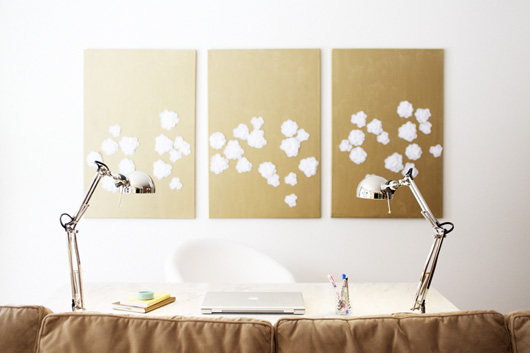
See that desk? That is a slab of polished carrera marble on a white, wooden base. Jess found it somewhere... I forget where... for $120. I hate her for it. I mean, come on. You can barely buy a desk from Ikea for that price. And we all know how I feel about carrera marble.

Moving on. To save on artwork, Jess painted the gold and white trio that hangs in her office space...

...as well as the floral painting above her headboard. Jess found the night stand on a curb and gave it a fresh coat of white paint. Ahhh yes. A girl after my own heart. I'm telling ya, it pays being crafty. The headboard, duvet cover, and lamps are all from my personal favorite, West Elm. Another virtual high five to Miss J.

Love this soft color palette. Various shades of ivory, distressed wood, and fresh tulips readily translate into sleepy time bliss.

Further proof of Jess' limitless talent is Jess LC, her ever-expanding jewelry line. All named after Chicago streets, the various collections range from sterling silver earrings, and colorfully beaded necklaces, to braille-engraved pendants. Prices range from $20 to above $100, so keep them in mind for Valentine's Day!

And a warm-fuzzy congratulations goes to my friend, Jess. Bravo, and thank for your inspiring!

And many compliments to the talented photographer, Emily Johnston Anderson, another lovely friend who you may remember from a post I did back in November. Girl's got skillz. With a z.

Friday, January 28, 2011

Fashion vs Furnishings | 1.28.11


THE CHALLENGE:
A monogram to tote around
or a monogram to spruce up those bookshelves?

You have $20. Which do you buy?

Wednesday, January 26, 2011

A French Kitchen for the Masses


I was buying cookie cutters at the Crate and Barrel in Lincoln Park a few weeks ago when I came face to face with this beauty: the marble and iron island priced at $999. It's a look I've long loved, and after seeing similar pieces of furniture used in real kitchens, I'm convinced this is one item I would never tire of.

images 1, 2, 3 via per gunnarsson // image 4 via a diary of lovely

LCYgraphics Presents: DomestiKated Life

This post is long overdue. A couple of months ago, I received an email from Kate at Domestikated Life asking for help in her blog redesign. I replied with a resounding "Yes!" seeing as I was a fan of her site, and like I do with all my clients, I asked her to send any inspirational images or websites my way. The collages she put together blew me out of the water. Have a look.

It was my design aesthetic to a tee. Recognize any of the graphics from J.Crew's emails? And the selection of colors she chose was so well-curated. I got straight to work, and after a couple months and approximately 12,000 emails, we came up with a winning design.

You can clearly see how the coral, lime, and grey colors and the san-serif fonts were pulled from her inspiration. As for the background pattern, we tried doing a polka dot, but both ended up preferring the two-tone chevron. *Note, I designed the header and background, not the overall blog layout or fonts/sidebars.

Need a blog or logo design? Give me a holler! Contact: alaina.lcy@gmail.com


And now that I can shout it from the rooftops... Congratulations Bailey and Pete!

Tuesday, January 25, 2011

Love Is in the Kitchen

Meet Celia Tejada, the senior vice president of product and design at Williams Sonoma Inc. Meet Celia's kitchen. Everything you'd ever expect from a kitchenware and home goods guru, complete with three-inch carrera marble countertops, two ranges, and not a single overhead cabinet (Tejada is 5' tall and wanted the space to be practical).

The styling in this shot kills me. I can only assume Tejada owns most of the product line at Williams-Sonoma, and quite a few pieces from Pottery Barn, as well. Note the giant pocket watch clock. I have the smaller version next to my bed. But I must admit, my garlic collection doesn't hold a candle to Ms. Tejada's.

I spy and love one polka-dotted apron, two Persian-like runners (both of which are actually from PB), four vintage bar stools (although those might actually be PB also), and one extra perty wine fridge.

Rows of white dishes and red wine. What is this magical place? The window-backed shelf reminds me of a photo I posted ages ago. I'm sure the backdrop of natural light keeps the room bright even on San Francisco's gloomy days.

And finally. Because it wouldn't be complete without a red piano, oversized spotlight, and a comfy place to kick your feet up. Of course, if I had my druthers, I'd switch out all the red accents in lieu of soft yellow hues, and I'd prefer white cabinets to the dark wood, but other than that, I'd say Ms. Tejada aced this one.

Sunday, January 23, 2011

Ikea's Mystery Inventory

I recently became a regular reader of Ikea's blog, Livet Hemma. I don't understand any of what it says, seeing as it's written in Swedish, but the styling of the photos are all the inspiration I need. I saw a recent post featuring the work space above and immediately zeroed in on the folding desk with the words "WORK IN PROGRESS" scribbled on top of it. It not only caught my eye because I liked the look of it, but more so because I had never seen that product ever before. And sometimes I feel like I know the entire Ikea catalogue. So I clicked through the links, which took me to the Swedish Ikea page. I copied the product name, pasted it into the search bar on the US site, and low and behold, the GÖRAN table is available at my local store for $49.99. WHY had I never seen this table before?! You can search through all of the dining tables - it's not there. Search through the desks, the work tables - still it doesn't show up. I do not know or understand why Ikea has these little mystery items that are not included in the category searches, but I am sure glad I found this one. Ladies and gentlemen, I think I found my new desk.


1. chair | 2. table | 3. drawer unit | 4. lamp

Saturday, January 22, 2011

Admit it.


We've all done this.

Tell someone how you really feel today.

I like that.

: )

Friday, January 21, 2011

Fashion vs Furnishings | 1.21.11


THE CHALLENGE:
Words in hand or words underfoot?

You have $140. Which do you buy?

Thursday, January 20, 2011

Struck Gold

A reader and fellow blogger emailed me the other day asking if she could use images from the Gold Flatware post I wrote a couple weeks ago. I said of course and that I'd love to see the post once it was up. So this morning, Julie of Monkey Grass Hill emailed me the link to her post, and I am still glowing green with envy after reading it. Julie quite literally struck gold. You can read the whole story on her blog, but the short version is: on a regular trip to her favorite thrift store, she spotted an antique(?) set of gold flatware - we're talking full service for twelve, serving pieces, luncheon forks and spoons, and more - for $40!

$40!

Rereading my post, I noticed the flatware I featured ranged from $98-$115 a place setting! How crazy is that?! Julie got 12 place settings and then some for a fraction of the cost. Congratulations, Julie! Pretty please post more photos the first time you host a dinner with it.

Wednesday, January 19, 2011

Blue Whispers

Well, what do we have here? Yet another home that perfectly captures the look I'm after for my own apartment: worn-in accents paired with industrial appliances, coated in soft, neutral colors. Yep. That's the money-maker. I loves it. I wants it. I needs it.

But the one element that really sets this home apart from others like it are the moldings. Did you notice? They're blue. Soft blue - like a whisper. The pale color frames the white walls while complimenting the bleached wood floors beneath. I know colored moldings are a bit of a wild card when it comes to decorating, but this design was executed flawlessly.

Oh hello, permanent inspiration folder. I'd like you to meet some new photos I found. They'll be staying with you for a while. Hope you don't mind.

Tuesday, January 18, 2011

Kitchen Sneak Peek

I am so excited to show you my kitchen makeover, but I want to get it just right before revealing it. I recently bought new chairs for the tulip table - well, they are actually very old, but they're new to me - and the entire room is finally coming together. It only took a year. So I ask for patience, dear friends. You won't be disappointed.

*Tea kettle is the LiveStrong Kettle by Chantal, available at Bed, Bath, and Beyond - also available in other colors

Monday, January 17, 2011

Le Jour de Neige

The past two weekends have been very busy. I was helping other people move - the worst kind of move. It's not even your own stuff you have to schlep up and down stairs. Oh, and I painted my kitchen grey. Get excited for the before/after pictures! It looks kind of amazing.

Today, however, on this cold, snowy day off, I am going to relax. Do things for me. Run errands, organize my closet, and best of all, continue making progress in my Rosetta Stone: French Level 1 (which is amazing and I highly recommend).

La femme court.
Les hommes écrivent.
Le chien. Le chat. Le cheval.

Impressed? I didn't know what any of that meant two days ago. Now I can say it, spell it, write it, understand it. Brilliant! I was a Spanish kid all through my school days, and I've wanted to learn French for the past five or six years. And since 2011 is the year I'm finally returning to Europe (nothing is set in stone other than my determination), it will also be the year I learn the language of Loooooove. Capital L.

What are your plans for the day?

Friday, January 14, 2011

LCY Listens: Scala and Kolacny Brothers

I had to share this new music discovery with all of you. I'm sure you'll recognize one of the songs - a cover of Radiohead's "Creep" - from The Social Network trailer. But it was last week that I began investigating, after seeing the promo for the PBS miniseries, Downton Abbey, and hearing the same female voices covering Sting's "Every Breath You Take." Turns out the Scala and Kolacny Brothers is an award-winning Belgian girls choir known for covering pop music in addition to singing original pieces. Two brothers, Stijn and Steve Kolacny, have produced more than 10 albums with their choir, and I found out they'll be touring in the States this spring. This is one group I'd love to see live. Enjoy.


"I'll Be Watching You" (originally by Sting)
for Downton Abbey trailer

"Creep" (originally by Radiohead)
for The Social Network trailer

"With or Without You" (originally by U2)

"Champagne Supernova" (originally by Oasis)

"Use Somebody" (originally by Kings of Leon)

The choir covers faster, more upbeat songs, but I think the ballads are the most beautiful.

Happy Weekend!

Thursday, January 13, 2011

To Open or Not to Open?

That is the question.

Famed blogger and designer Erika McPherson of Urban Grace designed this kitchen for her best friend Marla (who also happens to be a very talented photographer). When I read Marla's post relaying the details of the furnishings, she mentioned that the original plans included upper cabinets, but because of costs, they put in open shelves instead. I know this is a big trend right now and will probably fade in a few years, but I love this look.

Think of all the money we spend on beautiful dishes, and serving platters, and charming drinking glasses from Anthropologie, only to hide them away behind a door. Open shelves offer the perfect opportunity to make the kitchen even more beautiful by displaying your stacks of white every day dishes and rows of wine glasses. I even considered taking the doors off the upper cabinets at my place, but this old apartment might be the dustiest place on earth, so that would not have ended well.

What are your thoughts on open shelves?

photos via Urban Grace

LinkWithin

Blog Widget by LinkWithin