Tuesday, May 31, 2011

Those thrifty Ikea stylists are at it again...


...this time luring me with the display-top sawhorse desk and charming porch arrangement. Would you ever guess either of these spaces were filled with Ikea goods? No. Me neither.

How was everyone's weekend? It was cold and rainy here most of the time, but yesterday's sun-filled heat wave made up for it. Sorry for not posting yesterday, but I was out enjoying some classic American BBQ, cold beer, and a few games of Bags and Catch Phrase with friends.

Summer. Has. Begun.

Photo source: 1, 2

Friday, May 27, 2011

"Now, just imagine you're surrounded by tiny little seahorses."

Over the past year, I've worked on several projects that have asked for a headshot. My reaction was to send in photos of myself with other people's faces and limbs cropped out of the frame. Real profesh, Alaina. So, I figured it was about time to get myself a legit photo. I've been blogging for two years. It was time.

Enter Maia Harms, the trifecta of talent: one part photographer, one part blogger, one part DIY fantastico. Before moving to LA this month, she came over (the week of her wedding, mind you) to shoot my apartment and me. Sidenote: I'm not super comfortable with having my picture taken. A recent study indicates 97% of my Facebook photos feature me with a cocktail in hand. Apparently that's the only time I allow anyone to snap my photo. Classy.

So yea... needless to say I was decently awkward.

And I was 98% convinced I was going to look something like this:
"Now, just imagine you're weightless, in the middle of the ocean, surrounded by tiny little seahorses.... [Takes photo.] That was the one. I think that's gonna come out really nice." 
- Napoleon Dynamite

Somehow, between the constant laughter, stiff hand placement, and general awkwardness, the talented Maia Harms was able to pull off a few shots of me looking like a normal human being.


And now they're on the blog (top right sidebar and About Alaina page). Look at that! 

Too legit to quit now.

But that's not all from the Maia/Alaina collaboration. I redesigned her blog, Little Dwell. See below.


...as well as some other blogs you may know! They're all awesome. I encourage you to check them out.


Love of Fair

So that's that. I've been a busy bee. And I am so looking forward to this three-day weekend! I'm sure I'll come out of it with a few cocktail-donning photos to post on the ole' FB.

Have a good one, all!

The end.

Thursday, May 26, 2011

Leatherbound Art

The talented letterer and designer Jessica Hische is at it again, this time designing the covers of six classic novels. The leatherbound collection, sold by Barnes and Noble, includes Pride and Prejudice, Jane Eyre, Dracula, Huckleberry Finn, Wuthering Heights, and The Picture of Dorian Gray. The pages are all edge-painted, they have marbled endpapers, and all include a ribbon pageholder. For $63, they make a great gift for the bookworm or graphic artist in your life.

Wednesday, May 25, 2011

Put It in Neutral

I am always so impressed when someone manages to pull together a room without any use of color - yet alone an entire house. The living spaces in this home are layered and interesting, with every shade of neutral in the mix. But it doesn't feel boring or stark. The collection of antique accents mixed with more contemporary furniture give the home character and keep the eye interested in the details hidden around the room. For example, did you notice there were two clocks in the kitchen? Or a magic eight ball nestled on a shelf? It's like a fun eye-spy game, with all of the tiny pieces working together to complete the overall, more complex picture.

via

Tuesday, May 24, 2011

My Dream Home


I was so excited Paloma of La Dolce Vita asked me to participate in her Dream Home guest series. Piecing together the perfect house was fun but also a real eye-opener. Sifting through photos of beautiful rooms, I really took notice of not only what I think looks pretty but what was practical. Characteristics and details and furniture pieces I'd actually want to live with every day. I'm quite starry-eyed at the home I put together; above are just a few details. I encourage you to check out Paloma's blog at 3pm EST to see the rest! Let me know if it's what you thought it would be or not!

Monday, May 23, 2011

Treehouse for Grown-ups

The May/June issue of Chicago Home and Garden magazine features this three-level treehouse nestled on the grounds of Sugar Creek Township in Wisconsin. A group of local artists and designers joined efforts to create the spacious cabin in the sky. My favorite details include the oversized chandelier made of antlers that had been shed on the property and the bell jar lights hanging above the outside table. But the vintage furniture and art and the sleeping lofts make this space charming and practical. What a fun place to hide out for an afternoon or evening. How fun would it be to drink wine and play cards under the stars with some friends? Or grab a book on a rainy day and cozy up in the library loft? I think more grown-ups could use a treehouse in their lives.

Photo source

Friday, May 20, 2011

Fashion vs Furnishings | 5.20.11


THE CHALLENGE:
The perfect summer blouse: lightweight and sexy,
or the perfect summer tabletop topper: striped and casual.

You have $98. Which would you buy?

see sources for the last fashion vs. furnishings here

Thursday, May 19, 2011

Calm, Cool, and Collected

Have you read the new Collected magazine? It's another online lifestyle magazine that launched last week, and I must say, I am quite impressed with the debut issue. It has its own look, a distinct style that can be described as sleek, minimalist, and refined. The well-edited content comes in at a manageable 85 pages, so readers aren't overwhelmed by incessant page flipping through home tours that seem to blend together and one too many product round-ups. While the homes featured might not be considered innovative or revolutionary in terms of design, they are lovely and perhaps more importantly for readers, quite attainable.

But perhaps my favorite aspect of the new publication is their homage to graphic design. The editorial layouts are beautiful and clean, with simple yet sophisticated font choices and no shortage of white space (a favorite graphic element of mine). The editors also plan on featuring graphic design in their articles, something we haven't really seen in other online publications. Even the pure, attractive design of their homepage caught my eye as straightforward and uncomplicated, enticing me to delve further into the magazine's pages.

All in all, I encourage LCY readers to check out Collected. I promise you'll enjoy it. And hats off to the founders Krista Schrock and Jessica Comingore on creating a beautiful publication. I look forward to future issues!

Wednesday, May 18, 2011

White Done Right

Plain white walls can often times make a room feel bare or unfinished, like you haven't gotten around to painting yet. But the white rooms above feel rich, layered, and complete. In addition to the eye-catching furniture pieces and bursts of color throughout the spaces, what really makes the walls stand out are the architectural details. Wood paneling, cove moldings, arched doorways, high ceilings, and oversized windows add interest to what could seem like bare walls. The rooms are bright and airy, and the items in the room really stand out against the blank canvas. My recommendation to those looking to try a white room: choose the room that offers the best architectural interest. Perhaps the ugly wood-paneled den that could use a face lift or the living room with the bay windows.

Obviously, us apartment-dwellers and most anyone living in a home built in the 70s or later might be a little skim on the architectural accents. If that's the case, and you really want an all-white room, it seems that a single oversized piece of art is the way to go. The large scale of it will add drama and give the impressive sense of being in an art gallery versus a boxy high-rise apartment.

Do any of you have white walls? Do you feel like the room is unfinished or do you like the clean, bright look of it?

Photo sources: 1, 2, 3, 4, 5, 6, 7, 8

Monday, May 16, 2011

"I dream in sequins."


How great is this lady?

Paradise Found: Carneros Inn Napa

Farm Restaurant at Carneros Inn

Boonfly Cafe
 

Carneros Inn Cottages 
photos below from Elements of Style

The number one list on my things to do in Napa was swing by the Carneros Inn and eat at FARM, the hotel's restaurant. After reading about the upscale, beautifully designed resort on Elements of Style, I haven't been able to get this wine-country paradise out of my mind. Fortunately, we were able to enjoy a delicious dinner at FARM - where the food was just as delicious as expected; I recommend the duck - as well as a quick bite to eat at the charming, red barn-like Boonfly Cafe. Go to Boonfly for breakfast but be sure to get there before 9am to avoid a wait.

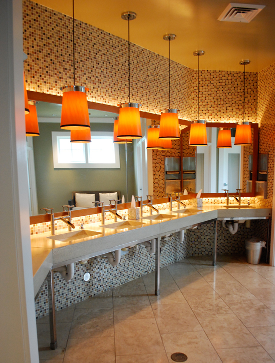
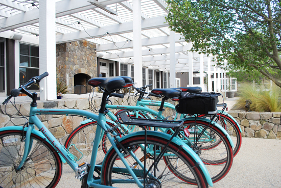
As you can see, no detail was overlooked in designing this sprawling resort. Guest cottages come complete with state-of-the-art espresso machines, al fresco showers and baths on private patios, and designer furnishings. Notice the white Eames lounger in the room above. The restaurants are equally impressive from the eye-catching lighting fixtures to the distressed leather chairs at FARM and the bentwood seats at Boonfly. And in the garden outside the restaurant, guests can entertain themselves with a game of bocce or by renting a turquoise bike for a cruise around the valley.

I can only imagine what it would have been like to stay at Carneros and relax by that pool overlooking Napa. Although I doubt I'd ever leave the grounds and get out to see the wineries. How does anyone leave this place once they've checked in? Have any of you stayed here or visited? It's definitely worth stopping by.

LinkWithin

Blog Widget by LinkWithin