I am loving the retro meets modern design of this new home I saw in Chicago Home + Garden magazine - and it's in my neighborhood! Homeowners Steve Bruss and Frank Golstin - designers at Hudson Home in Chicago - purchased the single-family house before it was completed two years ago and transformed the contemporary albeit run-of-the-mill space into the unique, style-packed house you see here. By mixing their collection of vintage and iconic furnishings, they created a space that subtly defines masculine glamour.

I don't see any use for having two sets of these Stendig armless chairs but that's kind of why I like it. I imagine it's a fun place to cozy up and enjoy coffee and the paper on a lazy Saturday morning. Or a good spot to play chess and drink wine (fun fact about me: I love chess).
Other than the lighting fixtures - which I can think of about 100 other options I'd have like to seen in their place - I have nothing to complain about in this dining area.

*Inspiration* I really like the look of horizontal art stacked on top of one another. Might want to try this some time soon.

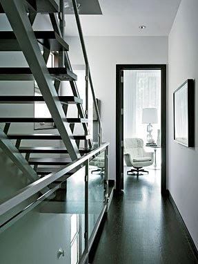
The chrome(?) and glass banister reminds me of the 1970s coffee table in the living room. The black moldings are pretty badass too.

I have to say, I do not care for the cabinetry in this bathroom, but the pretty teal tiles and that darling table next to the bath make up for it. On another note - why are large square tiles like this so rarely nowadays? Oh, I know - the overused and trendy subway tile. My mom has white tiles like these in her bathroom, and they make the room look so clean and pretty. I definitely recommend them if you're in the process of renovating.

I love so much about this bedroom. I mean, obviously - it's grey and white. But just to name it all for you: I'm digging the bold art, the black 1970s chair, the leather bench, the Colette headboard, and of course, the four-legged friend named Charlie who completes the picture.

Love everything about this vignette. Particularly the two great furniture makeover pieces: the old dresser that was painted in glossy white and the chair that was reupholstered in white leather and painted with a white lacquer finish. Also notice the green of the plant and the green in the art ties together perfectly.

*Inspiration* And then there's THIS mid-century dresser that was ALSO painted white lacquer. I just bought a vintage dresser from a thrift store nearby and plan on recreating the same look.

...and I'll leave you with this last image because it is so baller. I just said baller - hehe.
I'll let the writer of this magazine article tell you what you want to know, "a Fortuny Moda floor lamp from Lightology stands in front of a collection of pieces ranging from a close-up photograph of JFK by Andy Warhol to a tortoise shell from a Michigan antique shop."


I'm a mid-western girl myself! There are so many unique pieces in this home that add to the character.
ReplyDeletethey have some very cool pieces I would've never thought to include in decorating before. I also agree...the teal tile in the bathroom is to die for...
ReplyDeleteMidwest is blowin up!
ReplyDeleteI wish my coffee table was accessorized like that. But, in my house, everything on it would be eaten or thrown in a matter of minutes. . .
ReplyDeleteSUCH a HUGE fan of Hudson Home. The art in the first image - I saw that in a different magazine layout (or maybe it was this one?!) and I couldn't stop thinking about it. I do agree, however, that there are a few things that I might change if it were my space. But I guess that is what works here - the personality of the space suits the individual! BTW, love the title of this post :) Marija
ReplyDeleteThose are some seriously fab rooms. It's my first time visiting, but won't be my last - love your blog, I look forward to following! xo
ReplyDeleteBeautiful rooms and styling.
ReplyDelete